Education Through Motion for Cambridge
About the project
Date:
Nov 7, 2024
Client:
Cambridge Partnership for Education
Services:
Motion Graphics

Project Details
CPE’s brand identity is distinct from Cambridge University’s broader umbrella, while still requiring clear alignment with the parent brand. Their visual system uses bright colours, flat illustrations, and playful pattern elements that bring warmth and energy to their communications without compromising clarity.
A key challenge in this project was working within these guidelines — ensuring pattern elements occupied no more than a third of the screen, maintaining visual hierarchy, and balancing playfulness with professionalism. The carousel format required clean, frame-by-frame transitions to keep attention on the educational content rather than distracting flourishes. The goal was always accessibility and universal understanding, given the organisation’s global reach and varied audiences.
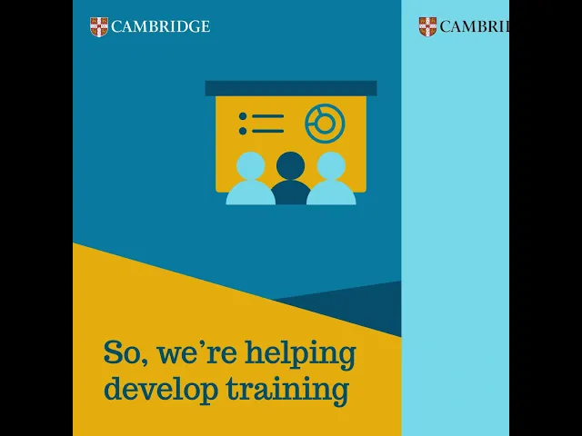
Each animation was designed to highlight key words and ideas, keeping the storytelling concise and universally relevant. Whether showcasing a partnership with UNICEF in Bangladesh or research into playful learning, the content was presented in a way that was easy to digest and adaptable across CPE’s communication channels.
The Outcome
The final motion graphic series delivered a suite of assets that were both visually consistent and strategically effective. By following CPE’s brand rules closely while adding engaging animated elements, the carousels captured attention without overwhelming the viewer. The clean, structured approach ensured clarity, while the bright palette and subtle patterned details made the work feel dynamic and approachable.
These animations now serve as an educational tool for Cambridge Partnership for Education’s global partners, highlighting their initiatives, reinforcing their credibility, and showcasing the positive impact of their collaborations around the world.
